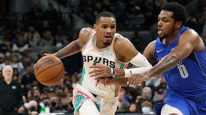
The San Antonio Spurs unveiled their revamped fiesta jerseys recently, and while the all-white kit does take a bold step, unfortunately, it does so in the wrong direction. Starting off with the actual jersey, the turquoise numbering really comes out of nowhere, given there is barely any other turquoise on the front.
I fear the numbers will be hard to read when watching the games on TV. Design 101 stipulates that having bright font on a white canvas is a horrible idea, and if you didn’t believe that before the jersey drop you should definitely be aware now.
The number could have also been the classic black, much like the lettering of “Spurs” across the chest, which I actually really like. The back of the jersey, however, is a total mess. The turquoise number carries over, and the names of the players are also in that same color, abandoning the traditional black altogether. It honestly looks like a concept jersey you’d find on Reddit if the artist tried to include everything and have absolutely zero finesse.
I understand what Nike was trying to do when they designed the jersey, but they clearly had no locals consulted on the project. The Spurs took to Instagram to explain each design element, and Nike really swung and missed with some of their ideas.
Apparently, the white is to represent a “clean canvas” to paint the next chapter of San Antonio basketball, but let me remind you in case you forgot: the San Antonio Spurs should be striving to be the Spurs of the past. Every team in the league tries to replicate the “Spurs’ Way,” so why San Antonio is brushing past that is beyond me.
They claim the colors pop and have “endless respect,” which I guess I can get behind. But you know which jersey had the same colors and looked better? Last year’s city edition jersey, with the clean black backdrop and colored stripes.
I will say, the merch is awesome and I will be spending all of my earnings from this article on some. The sweatshirt is fire, and the lanyard, flag, and everything else with the white background looks miles better than the actual jersey. The shorts are also hands down the best in the league. I mean, come on. The colored trip, diamond, ABA and Chapparals logo is so cool. I could definitely put together a great outfit surrounding those shorts, and I’m by no means a fashionista.
Ran across some of the newest fiesta merch that will be released on Nov 15th with the newest fiesta jerseys. What items will you be buying? #PorVida pic.twitter.com/Y6mal1sArL
— Ty Jäger (@TheTyJager) November 3, 2021
I do feel bad for Coyote. He opts for the Winnie-the-Pooh look, with just a shirt, sans pants, so he misses out on the best part of the whole kit. If I had legs like his though, I would also show them off, so I can’t blame him.
Note: This is part of an Air Alamo debate series. To see the counter-argument from another of our writers, click here.
